Tags
Books, history, James Bernard Gross, Letterpress, literature, Presentation bindings, reading, The LIQUORSTORE pomes, writing
Much has happened in the months since my last post including a trip to the Oxford Fair in December. In a couple weeks I venture forth once again for the 9th Manhattan Fine Press Book Fair and this time I will be bringing along the prototype for the newest book THE LIQUORSTORE pomes by James Bernard Gross as well as a couple presentation bindings to display before they go off to their permanent homes with collectors.
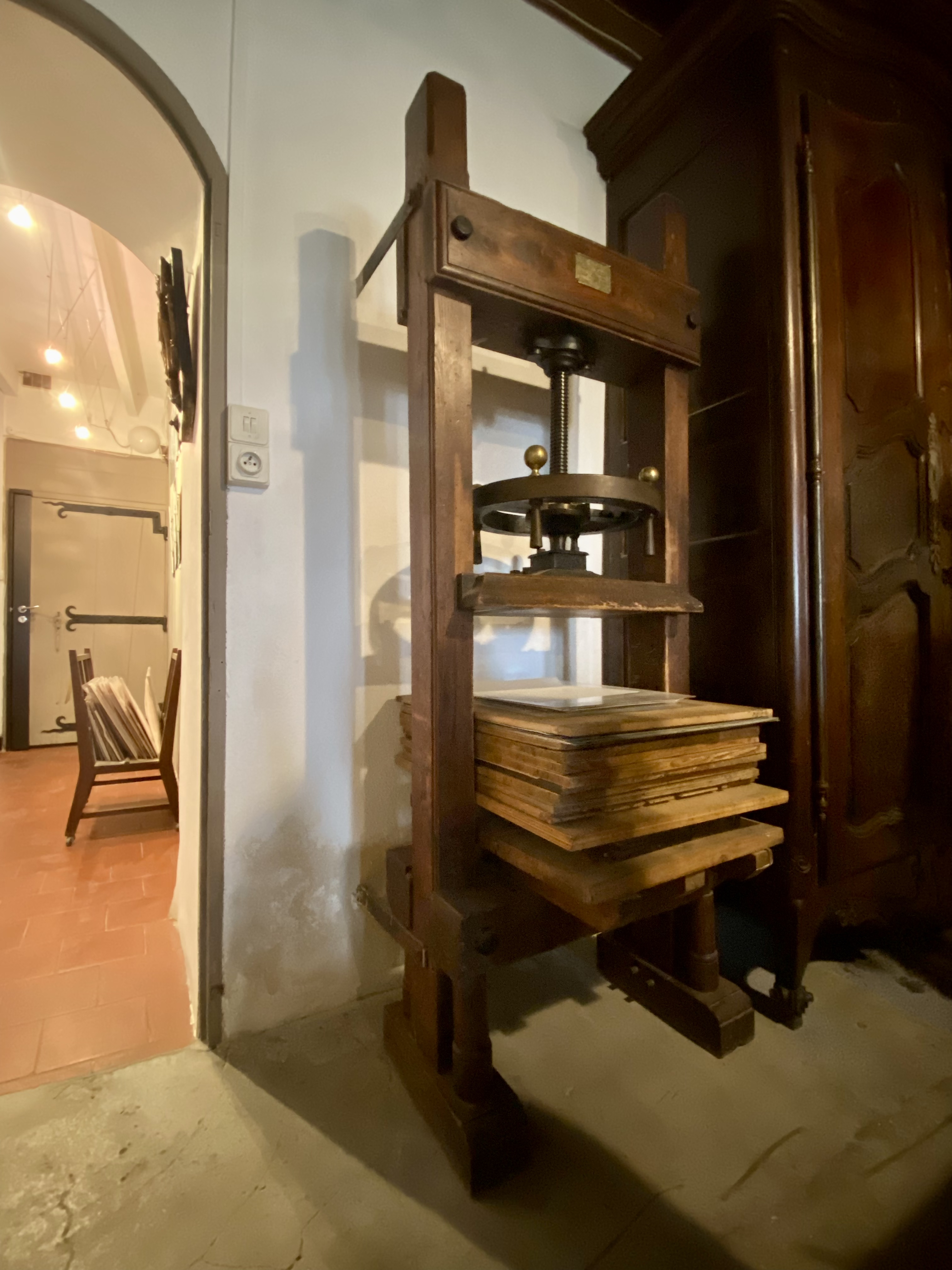
James approached me about his book well over a year ago and details around production finalized before heading to France last September so I could at least start on a couple of the wood engravings while overseas. In December, before and after Oxford, I was busy on my Linotype casting the text for the book. New acquisitions of logotype and diacritic matrices for one of the house typefaces, Garamond, have made typography on the machine equal to hand setting for letter fitment and it is always a joy to print from fresh type. The book will come in just under 100 pages for the 36 poems with an introduction from Toby Olson and will be printed on Hahnemühle Biblio paper in 12pt Garamond, an edition of 50 books in a 6.5 x 10 inch format. I’m still working on those wood engravings (the one shown below is a mere 2.5 x 2.25″) but the plan is for 3 or 4 within the book to illustrate. With luck the book will be in the bindery by June and will be available shortly after. Stay tuned here for more production pictures and details in the months to come.


Another commissioned binding for my edition of Kafka’s In the Penal Colony was recently completed for a collector in Australia. I’ve done five variations on this theme of a rugged leather coast with topographic features blind tooled into the sea for this book and I’m pleased with the way this one has evolved as well. A burgundy Sokoto goat hide for the spine and river grained goat on the boards which is heavily tooled. My usual treatment with thinly pared onlay and inlay work completes the scene. This closes the sale of the edition as well though I might be able to get a book or two from my co-conspirators on the project – Dellas Henke and Breon Mitchell (etchings and translator).


Oxford was a wonderful show and it was a pleasure to see so many of my European printer and binder friends gathered together just before the holiday. It was wonderful to hear so many impressions and stories about encounters with the work of Louis Jou from my European peers and even more encouraging for me to keep up my activities in Les Baux. The true highlight for me was spending time with one of my oldest friends who is currently teaching in Bath. “One cannot make new old friends” as the saying goes…


Finally, stretching back to last October in Les Baux at the Louis Jou Foundation, I taught a typography and linocut workshop for a couple students after the wood engraving class I brought Joanne Price over to teach. With both of them already possessing skills with lino cutting we dove in immediately to 2-color and reduction block work and in the period of 4 days the students came up with some very good broadsides! Working with Jou’s incredible typefaces and using his iron hand presses for production is an experience in itself. I spent a month in Les Baux last fall organizing Jou’s type, the leading and furniture and also breaking down old type forms lying around the studio gathering dust and being destroyed. While we have a supply of his type in book sizes the display type will never be able to be replaced so this was an important personal task for me to undertake. I’m pleased to say that our lovely museum is now a fully functional printing space. If Jou were to rise from the dead and return to his studio he could immediately begin production again.


And to conclude this foray into the world of Deep Wood Press I would like to invite all who can come to the 9th incarnation of the Manhattan Rare Book & Fine Press Fair on April 6th. Our usual location in the basement at The Church of St. Vincent Ferrer, 869 Lexington Avenue just across the street from the ABAA New York Antiquarian Book Fair at the Park Avenue Armory. Join me and 35 other private presses, book artists, makers and takers from around the world as we bare our souls in the city that never sleeps.